PACKAGING DESIGN
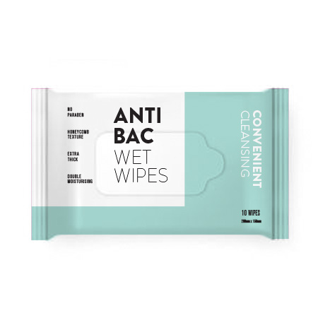
In a market filled with wet wipes packaging designs that are predominantly catered to attract moms and children, we discovered that there were no wet wipes that felt unisex enough for men to carry despite men being frequent users of wet wipes as well.
We created a sleek, minimalistic design based on the idea of removing stains and spills. Steering away from colours and typographic treatments deemed too cute, which typically plague wet wipes’ packaging design.
![Mock Up-1-2.jpg](https://images.squarespace-cdn.com/content/v1/56d56c20b654f96f882e9234/1536252434877-VI8U955CRQY3J9FW2BBL/Mock+Up-1-2.jpg)
![Mock Up-7.jpg](https://images.squarespace-cdn.com/content/v1/56d56c20b654f96f882e9234/1536211200356-PI8KW2Z1XR0C4PXPUNW6/Mock+Up-7.jpg)
![Mock Up-2.jpg](https://images.squarespace-cdn.com/content/v1/56d56c20b654f96f882e9234/1536211199318-QKEJHP9OEKL352BLU8R7/Mock+Up-2.jpg)
![Mock Up-1.jpg](https://images.squarespace-cdn.com/content/v1/56d56c20b654f96f882e9234/1536211199060-ORHEJPT2RRNE9QC0W1UX/Mock+Up-1.jpg)