So… app? Soap?
So, which one is it?
If you can’t beat them, sometimes the best strategy is to join them.
Soapp Chat was originally named to sound like soap-chat. But since its launch (and initial branding), it has had trouble getting its users to correctly pronounce it. Most people associated it to WhatsApp (because of similarity of previous brand colour) and pronounced it similarly to WhatsApp as well.

The key differences.
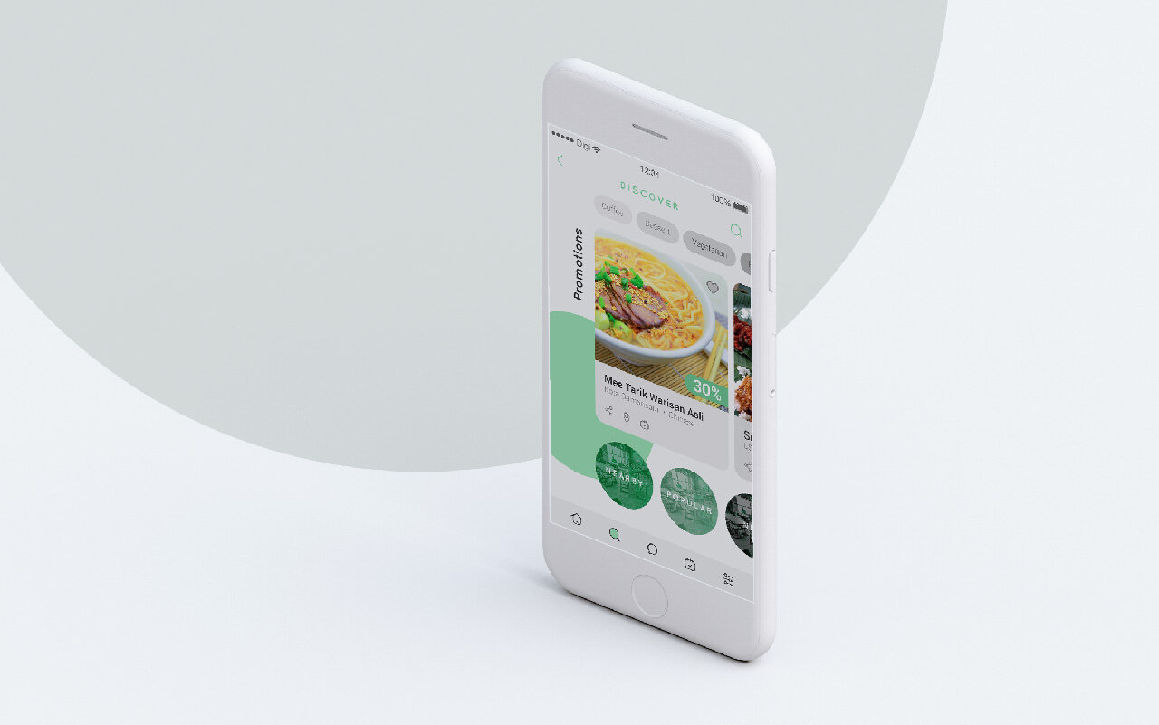
The main difference of Soapp Chat compared to other chat applications are the fact that it also functions as a scheduling and booking app to spur on friends to gather.
In the logo redesign, we strategized two main approaches: differentiate the brand by focusing on the scheduling at location system OR different the brand by focusing on the original idea of soap.

Make it stand out.
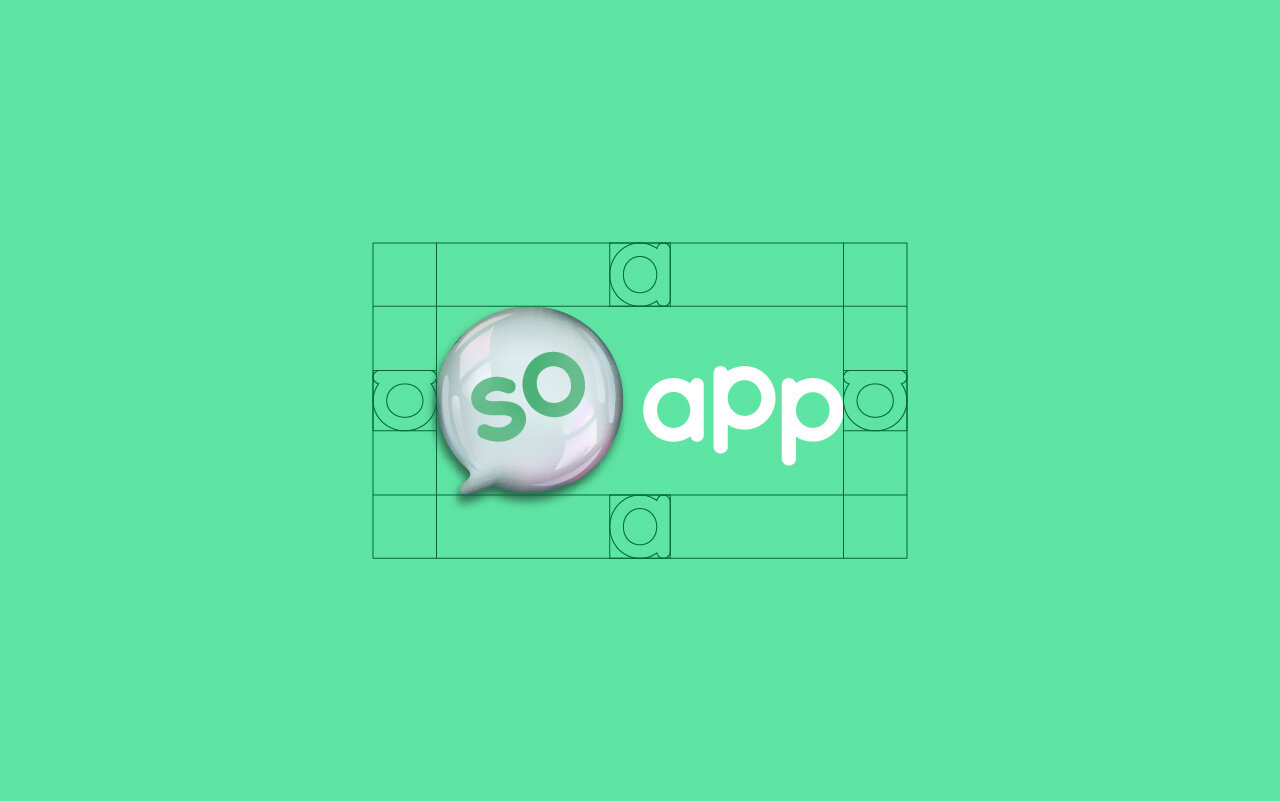
After the idea of “soap” was chosen, we wanted to distinguish the main appearances of the brand. When we were brief, the brand’s logo was in a very similar green and had a chat bubble app icon. That made it extremely hard to differentiate from other apps.
At the juncture of this design project, our production expertise has allowed us to know that printing advancements are now making it more feasible than ever to produce brand materials consistently without needing to use a simple flat colour.
Hence in our ideation phase, we have decided to go with a hyper realistic bubble appearance for the chat bubble and use a slightly fluorescent hue of green. This would keep similarities of the brand to its previous identity while differentiating it from its competitors.


As designers, we often can’t help but resonate with Katy Perry. Over the years, we have lost so many good designs we wish were chosen by the clients. Attached below are some interesting ideas that didn’t make it past the proposal stage. That calendar pixel emoji that transforms for different usage was our personal favourite.
“The one that got away”

